2016: Then and Now
The jump-off point for this analysis has to be the evolution of the QC over the last two months. If you remember from the January Analysis (or read it just before reading this one), I made a prediction about the transformation of the curve. I predicted that once teams got into conference play and began playing against better quality teams on a night-in, night-out basis, the QC would rotate: teams at the top would rotate downwards and teams as the bottom would rotate upwards. The February Analysis showed that perfectly (but logic would have driven any one to that conclusion). The March Quality Curve has also made a significant move, and one I DID NOT see coming. It was so significant of a move, I almost posted an interim update before doing this one. So, what happened??????
 There has been a noticeable downward shift in the QC from February to March. In fact, the only two areas of the curve that have not seen the same magnitude of the downward shift are the 1/2 lines and the 8 line. The teams in those groups have changed, but the efficiency values of those groups are only slightly reduced. It is kind of shocking to see that teams in the 9-12 range are almost exactly where they were in January. If I had made that prediction in the January Analysis, I would definitely be taking a victory lap for that call. The gap between the blue (Feb) and pink (Mar) curves in the 3-7 range is equally shocking. Typically, I can find explanations or patterns of trend in data and charts, but I cannot figure this one out. Feel free to speculate in the comments section below with your own explanations, and if I see one I like, I may reference it in the Final QC Analysis scheduled for Selection Sunday.
Here are some things to consider in your theorizing:
- In order from top to bottom, the 1s and 2s in February were OKLA, IOWA, NOVA, UNC, UVA, MIST, TXAM & MARY. In order from top to bottom, the 1s and 2s in March are MIST, NOVA, UVA, KU, UNC, OKLA, WICH & WVU.
- In order from top to bottom, the 8s in Februrary were USC, TEX, DAME & MICH. In order from top to bottom, the 8s in March are HALL, GONZ, VALP & DAME.
- We've seen the collapses of OKLA, IOWA, TXAM, MARY & USC. We've seen the surges of MIST, KU, TEX & HALL. Yet, these surges and collapses simply replace one another in the groups. They do not explain an across-the-board .01 average-point downward shift.
2016, 2015, and 2014
The next point of analysis is the comparison of the 2016 QC with the past two years.

With this graph, we ask the all-important question: What kind of tournament can we expect to see with this year's teams? At this point, the 2016 QC lines up approximately seed-for-seed with the 2014 QC, except that 1s and 12s are slightly weaker and 9s and 10s are slightly stronger. In other words, we can expect an upset-ridden tournament. The Elite 8 aggregate value for the 2014 tournament was 36, matched only by the 2011 tournament, and the next closest tournament in the one-and-done era is the 2013 tournament with an E8 aggregate value of 28. I would highly suggest to dig out your 2014 bracket and get it to know it very well. I feel like a matching model of the 2014 bracket will be a very good strategy for your 2016 predictions.
Evolution of the 2016 Seed Curve
Though the analysis up to this point looks very convincing, it all comes down to how the Selection Committee seeds the teams. With the popularity of bracketology, we can simulate this step ahead of time. Using the same bracketologist as last time, the current projected bracket for the 2016 tournament produces the SC below.

This is quite a strange picture. Very rarely does the SC and QC line up like they do here. I don't want to put too much emphasis in this image as it is not the actual bracket, but I do find it interesting that it does match up so closely and that its divergent spots -- the 8, 9 and 10 seeds -- were also spots of interest in the earlier images. The 8 seeds in the QC (first image) didn't experience the downward shift that the other seeds did. The 9 and 10 seeds in the QC (second image) are slightly stronger than their 2014 counterparts. I must reiterate, though, that I do want to over-emphasize this graph, as it is not the final bracket.
- It could be subject to bracketologist error, such as a mis-reading of the Committee's values or goals.
- It could even use Efficiency Ratings into making the bracket itself, which would explain why it is so similar.
- If we've learned anything about this season, it is that a lot can change in the span of just two weeks, which is exactly how long we have until the actual bracket is revealed.
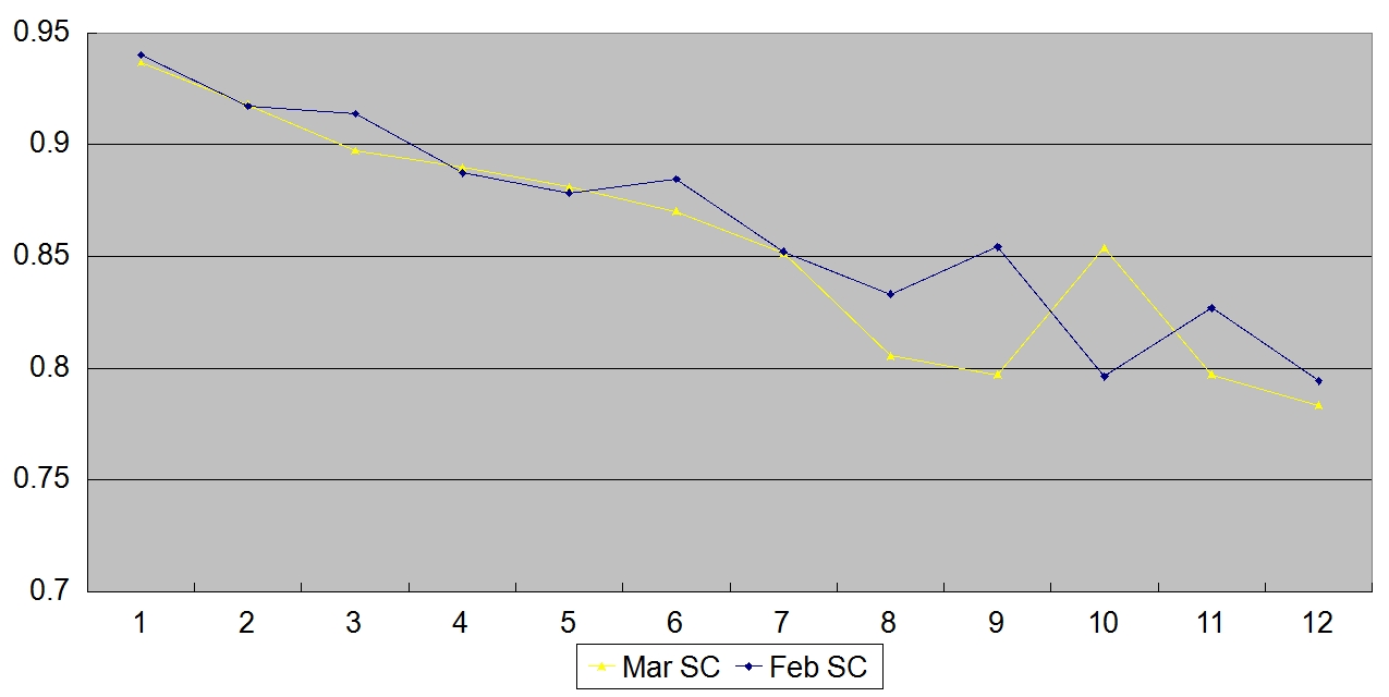
Again, the majority of the changes can be attributed to the "who gets seeded where" effect. The flattening at the 3 and 6 seeds is also attributable to the flattening of the QC from February. Some final points of interest regarding the current SC:
- #7 DAYT, #8 COLO, #9 PROV, #9 SCAR, #11 ORST, #11MONM, #12 SDST, and #12 TEM are not counted in the QC. They do not rank in the Top 50 KenPom Ratings for tournament-eligible teams. The latter three are projected "IN" as auto-bids based on regular-season standings (not tournament conference champions, which haven't been played yet).
- The seed-group with the largest spread between the highest- and lowest-rated teams in the seed group is the 7-seed group with WICH as the #8 KenPom team (What an under-seeding!!!) and #55 DAYT (who would qualify as a #13-seed).
- Ironically, the 10-seed group (arch-nemesis of the 7-seed group above) has a KenPom average higher than their rival. All of the teams in this group should have higher seeds based on their efficiency ratings: VAND should be a 6-seed, CONN and CIN should be a 7-seeds, and VCU should be a 9-seed.
Conclusion
I was hoping the March Edition would clear up a lot of loose ends before the Final QC Analysis following Selection Sunday. While it gave us pretty clear evidence that the 2016 tournament looks to be a replay of the 2014 tournament, the across-the-board drop in the efficiency ratings remains a mystery. If you have any ideas or suggestions, leave them in the comments below. I also plan to do a few more articles before Selection Sunday. Here is what you can expect to see in the coming weeks:
- An explanation for the pre-SOHS era tournaments using the Aggregation Model.
- An Update to the PPB Watch-list with my commentary on the college game since the last update.
- A Pulse Check on the Tournament. If you followed BracketScience, you will know what this is. If you didn't, you are in for a treat.
- One or two surprise articles following up on previous articles.
No comments:
Post a Comment